o'hachi Brand Design
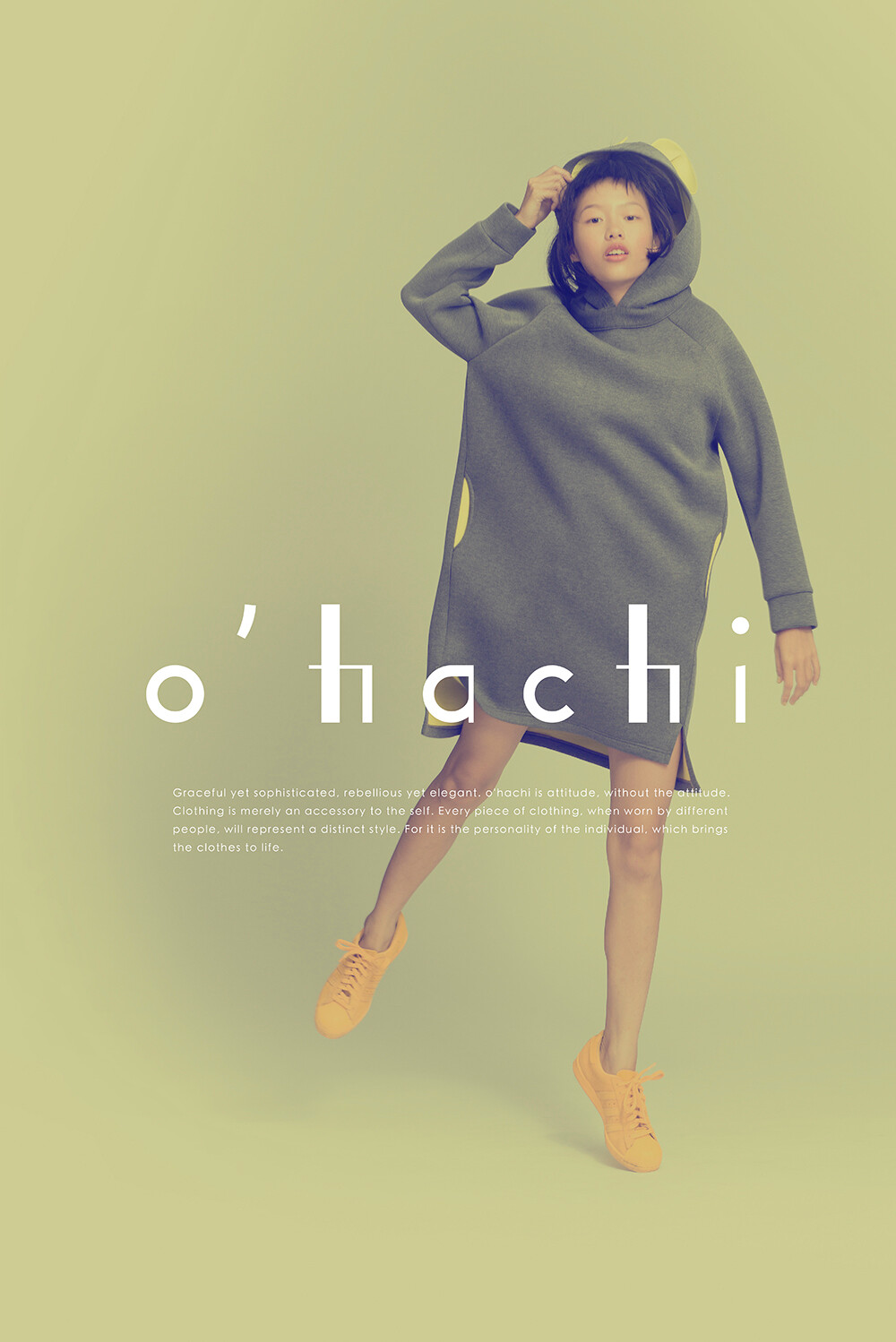
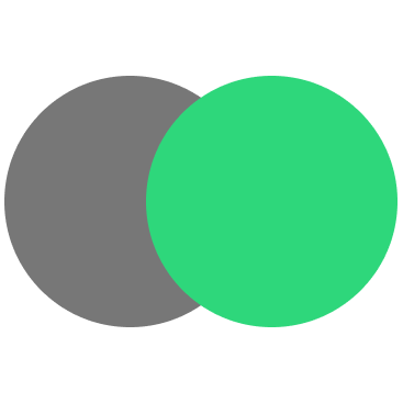
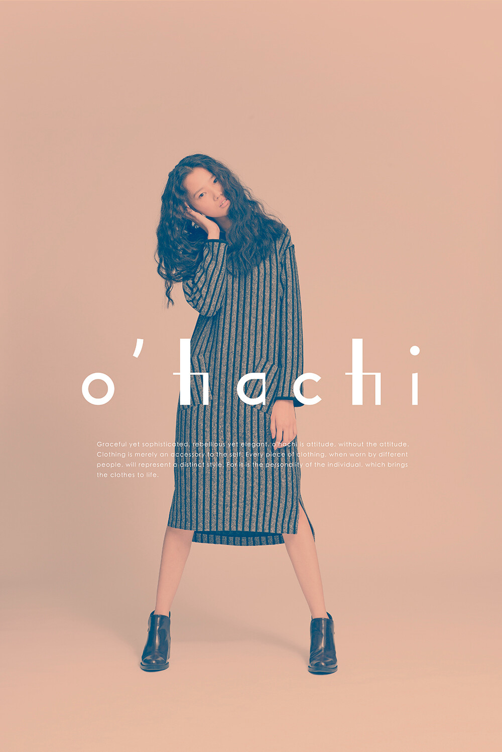
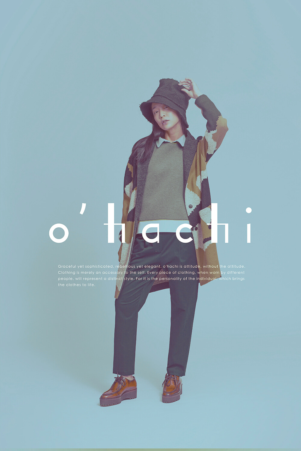
o'hachi cannot be defined, for it is not an extreme. Yet it can exist within the broadest of spectrums, with simple lines which converge into a fusion of cultures, allowing the creation of styles unique to each individual. o’Hachi
不極端,所以無法被簡單地劃分出歸屬 ,但卻也擁有最寬闊的存在範圍,我們透過簡單不同粗細的線條裡,勾畫出多種文化的融合,也變化出只屬於自己的個性
Role
Brand and Interface Designer
User Researcher
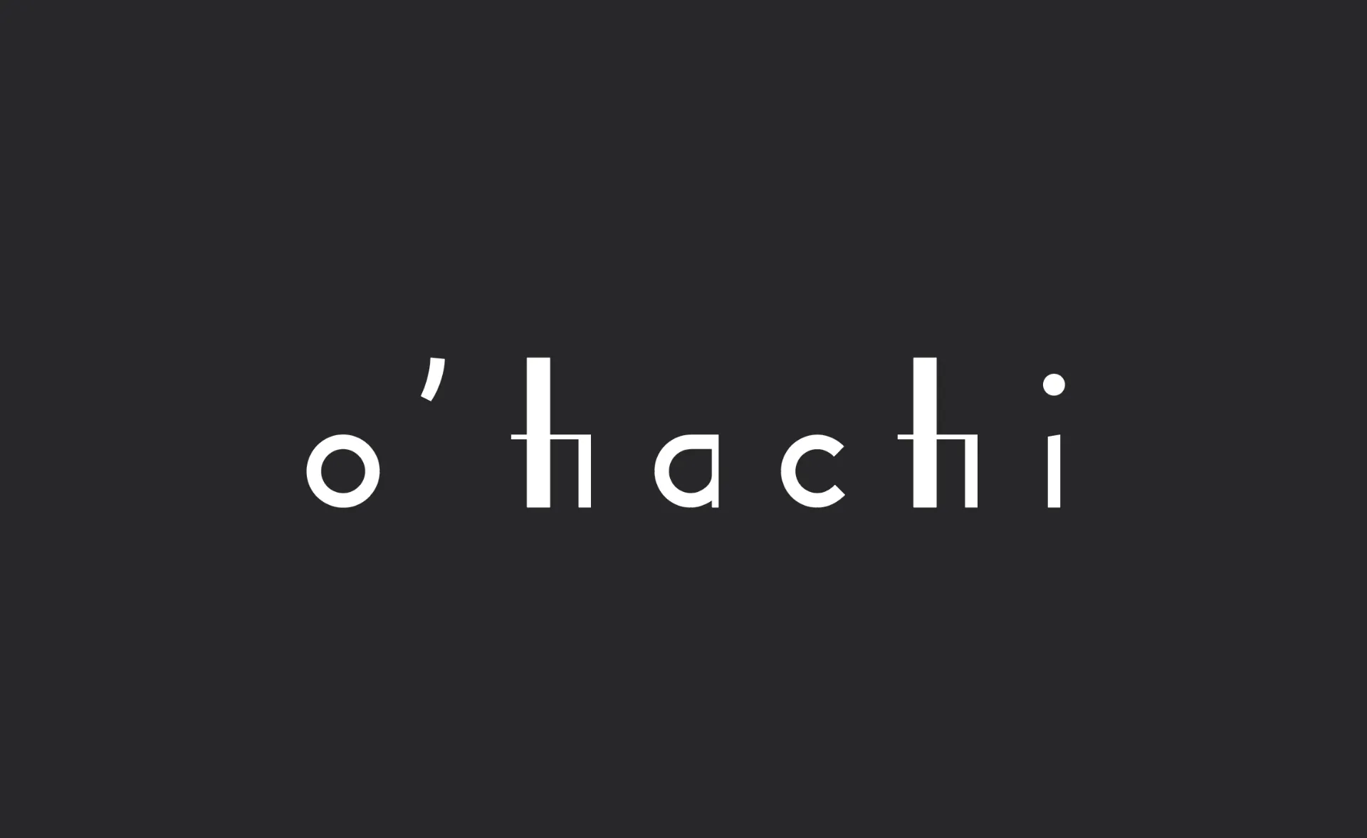
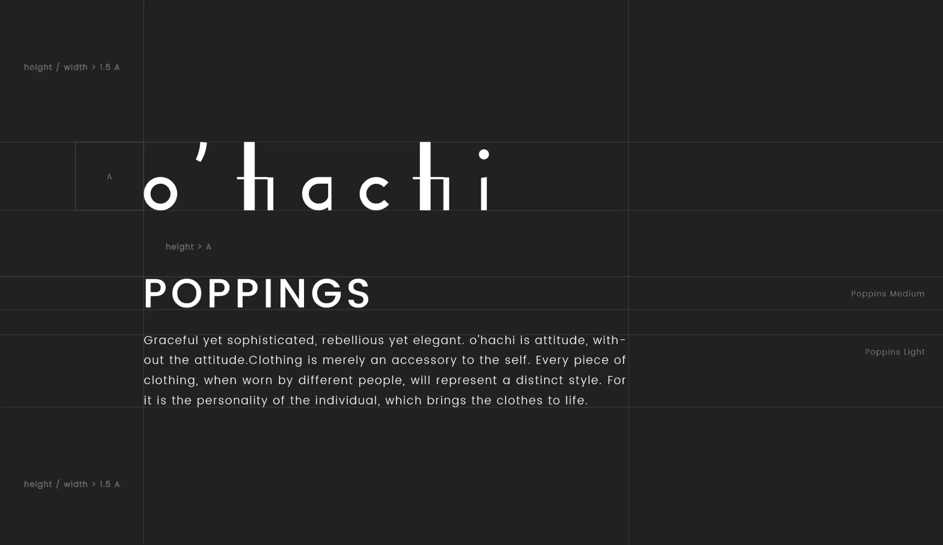
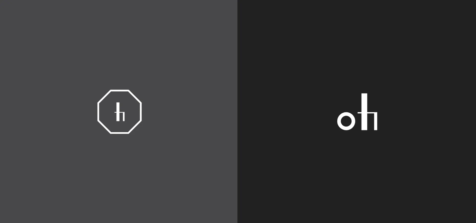
"Hachi" is the Japanese word for "eight," and the octagan symbolizes the many facits of the brand's boundless creative style and future potential. hachi
The name "o'hachi" can also be expressed in another icon design - "oh!" is an expression of surprise, and with the name "o'hachi", we are hoping for our products to bring pleasant surprise to our customers, time after time.
原意為日文的八,利用八角型來象徵多面向無拘束縛的品牌風格 讓形象延伸性與發展性提高
利用品牌名的變化,來創造另一個icon,oh有驚喜訝異之意,希望o‘hachi,的作品皆可讓顧客感到警喜之意

宣傳影片:拍攝花絮
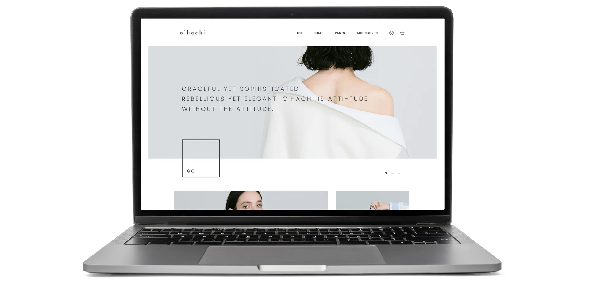


o'hachi 不極端,所以無法被簡單地劃分出歸屬
o'hachi cannot be defined, for it is not an extreme.